Lidl, a multinational supermarket chain, approached us to create a style guide for their digital platforms. The primary goal was to create a unified design language across all digital channels to enhance the user experience and streamline the development process.
We began by conducting a competitive analysis of Lidl's direct competitors, as well as industry leaders in digital design. We also reviewed Lidl's existing digital platforms, including their website and desktop application. Based on this research, we created a list of key design elements that would be important for the new unified style guide, including typography, color, icons, and imagery.
To ensure that the unified platform met the needs of Lidl's customers, we created user personas based on customer data, which helped us to get a better understanding of user needs, motivations and expectations.
Based on the research and user personas, we developed design directions that would inform the new style guide. The design direction included visual mood board, style tiles and sample screens for Lidl's desktop application. We provided visual language options to the team to review and provide feedback.
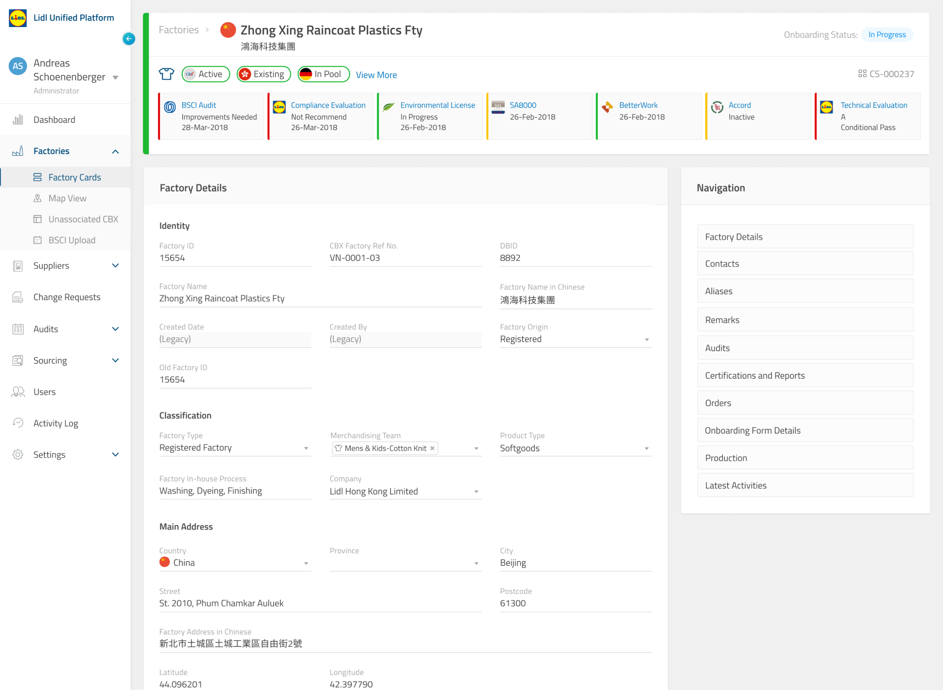
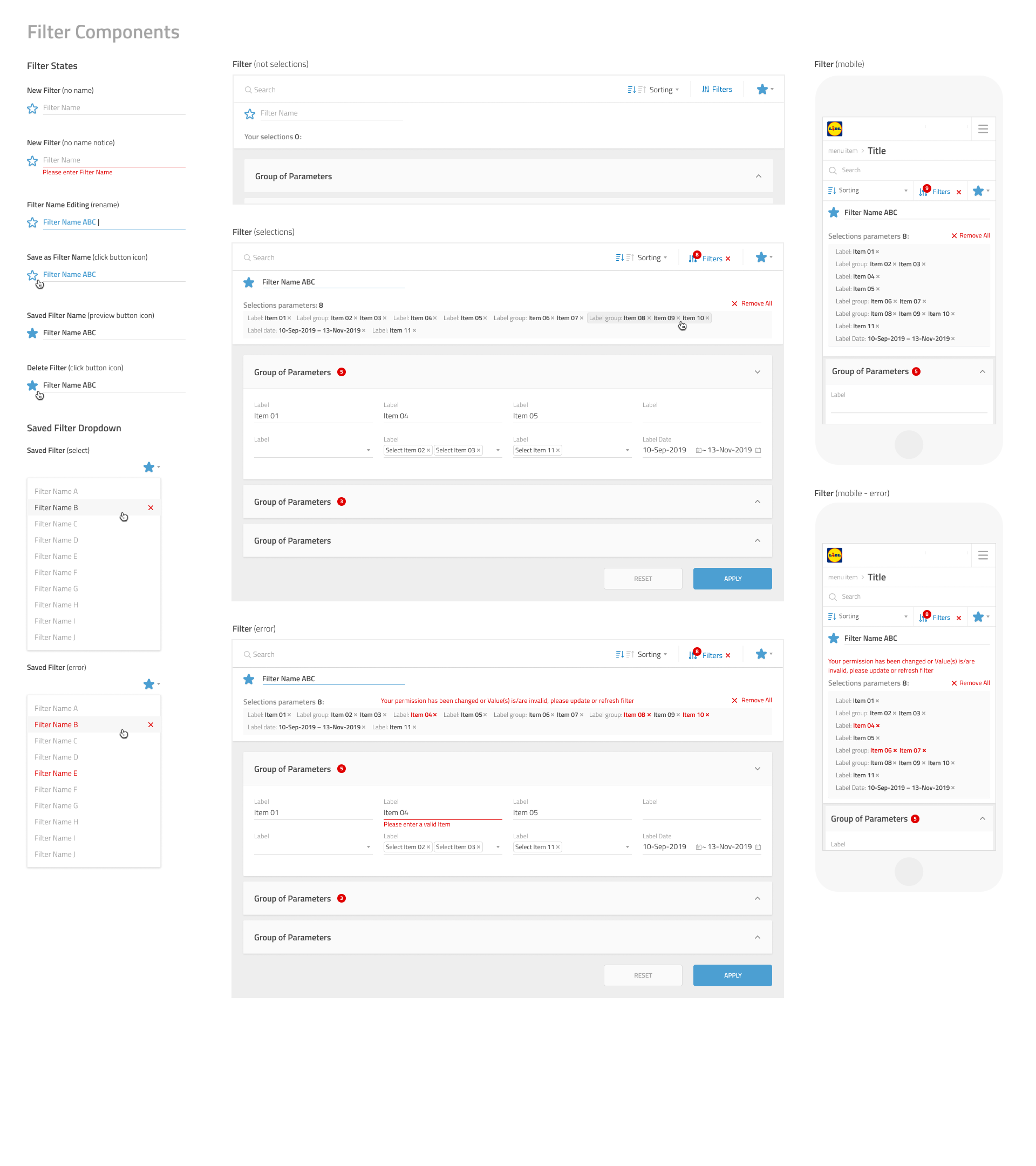
We created a style guide documenting various design elements, such as typography, color, layout, microinteractions, and imagery. The guide contained guidelines for Lidl's desktop application, and included both visual and written instructions. To help facilitate easy adoption of the style guide, we created a Sketch Library, with all the design files incorporating the Lidl’s new visual design language.
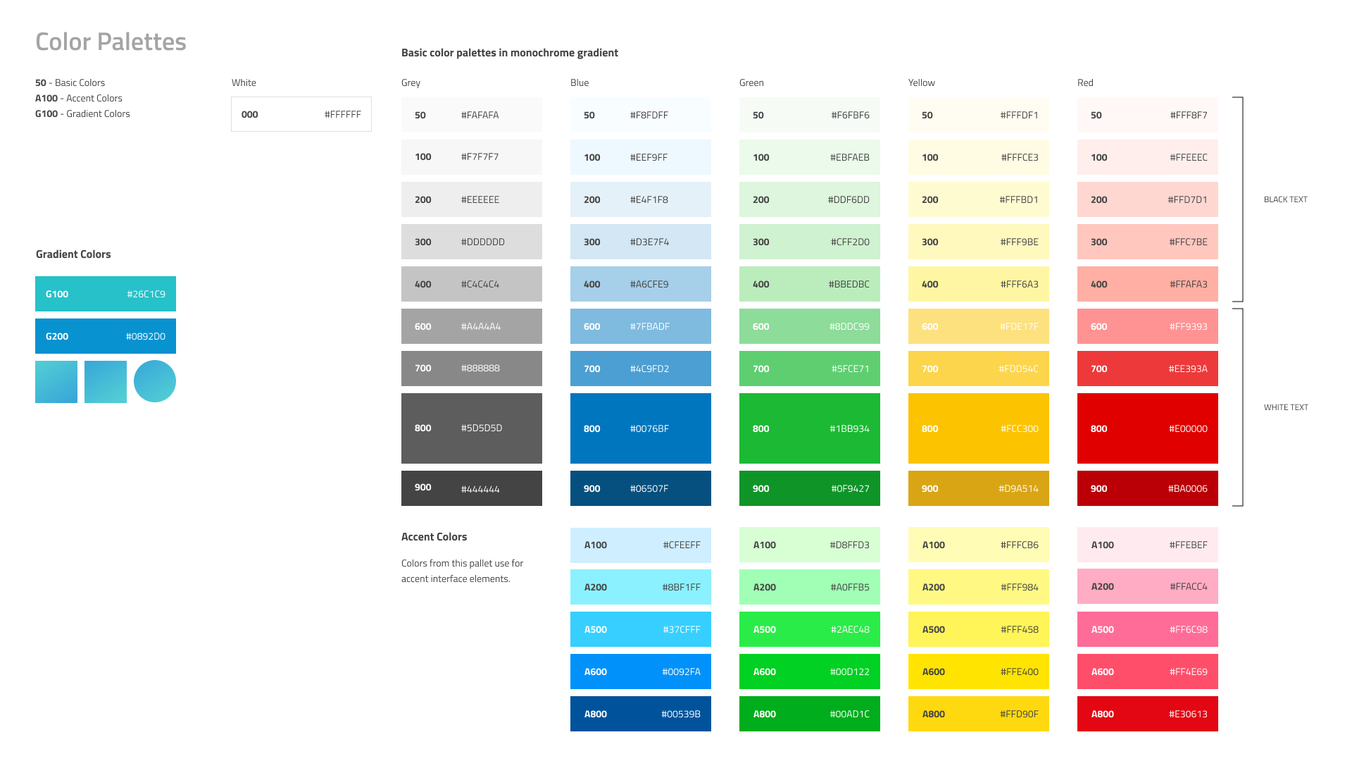
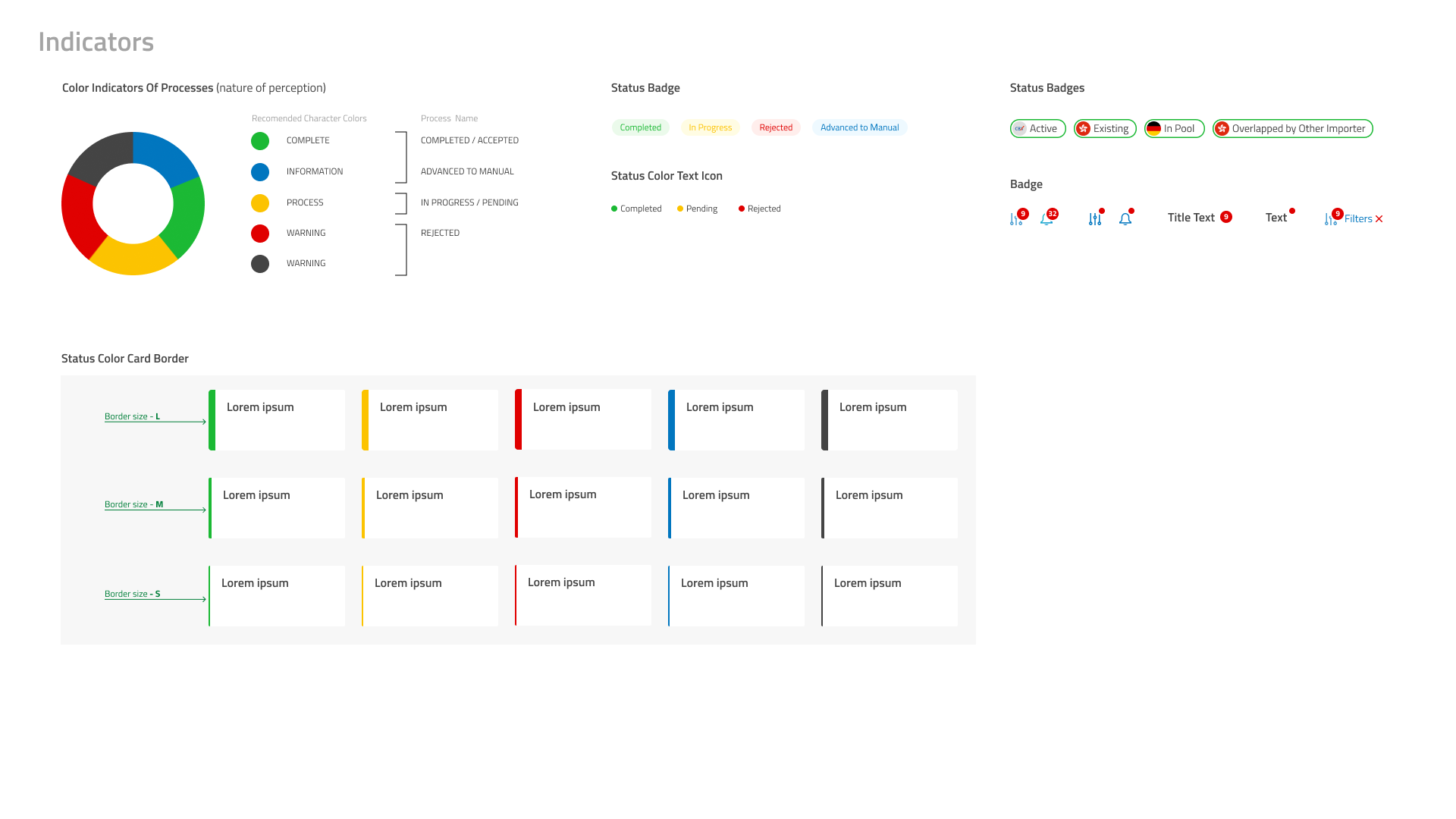
The color palette consisted of primary, secondary, and accent colors that would be used consistently across all digital platforms. The guide provided specific codes for each color to ensure consistency in reproduction. We also showed examples of how these colors could be used together to create a cohesive design.
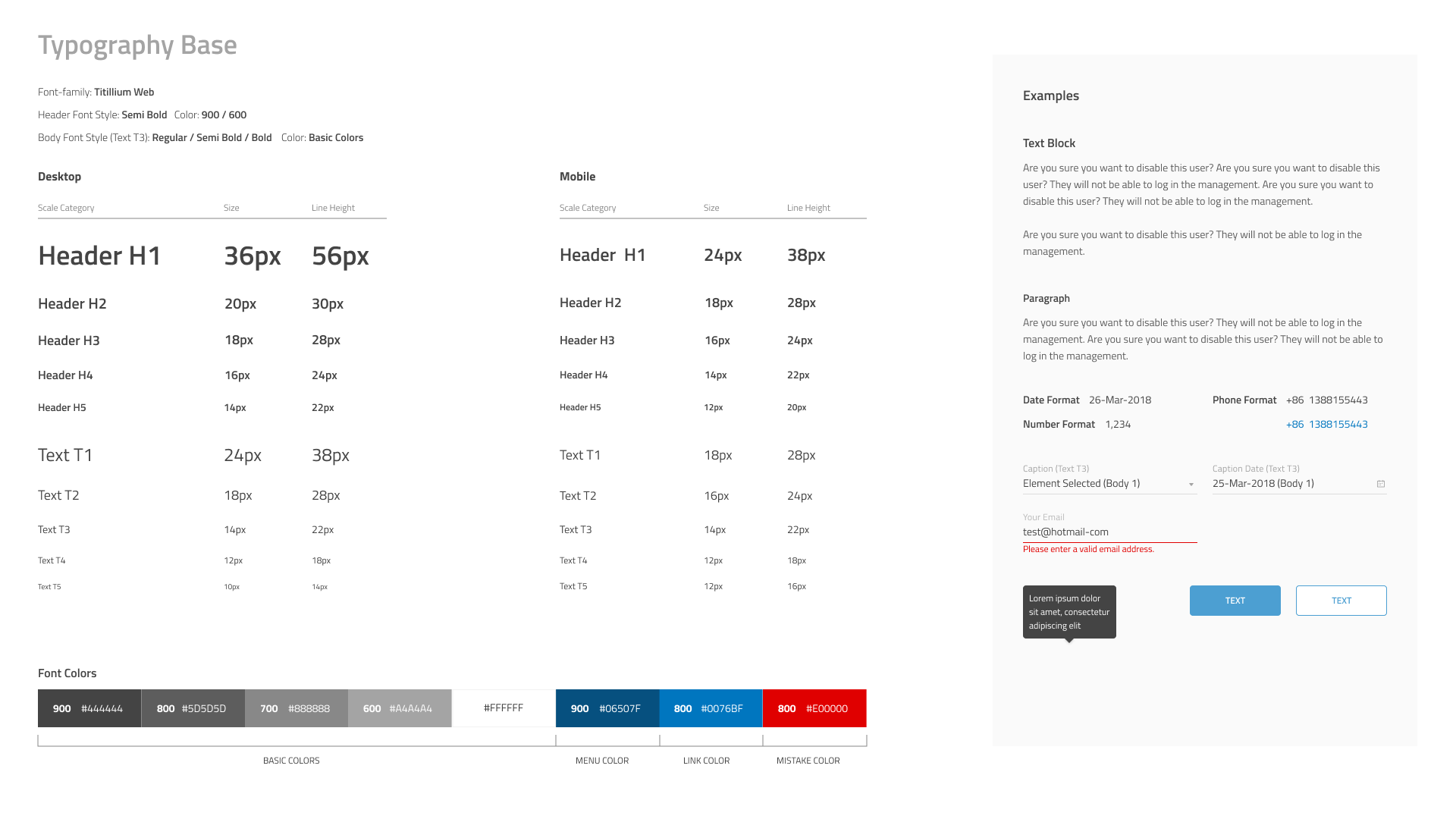
A clear and legible typeface was selected as the primary font to be used across all digital platforms. The guide also provided clear instructions on font sizes, line heights, weight, and contrasts to ensure consistency across all typography.
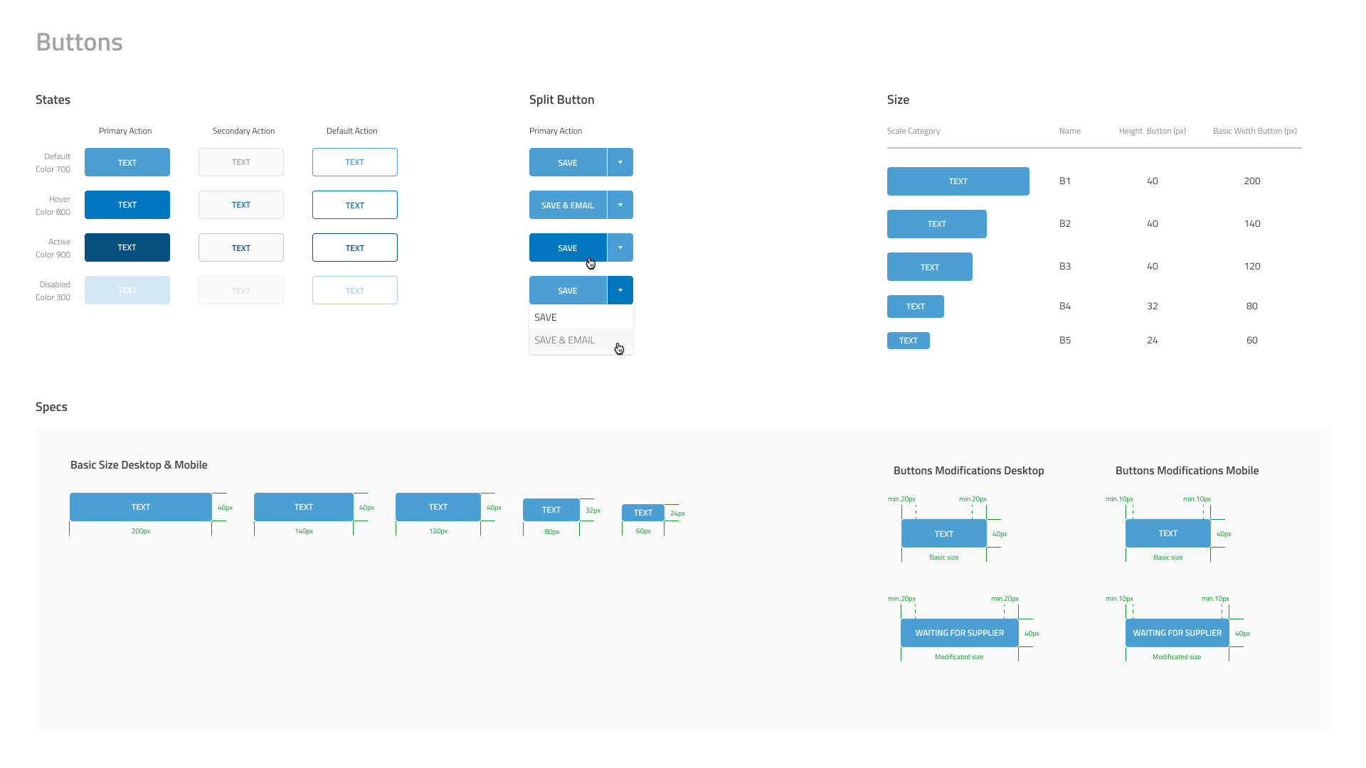
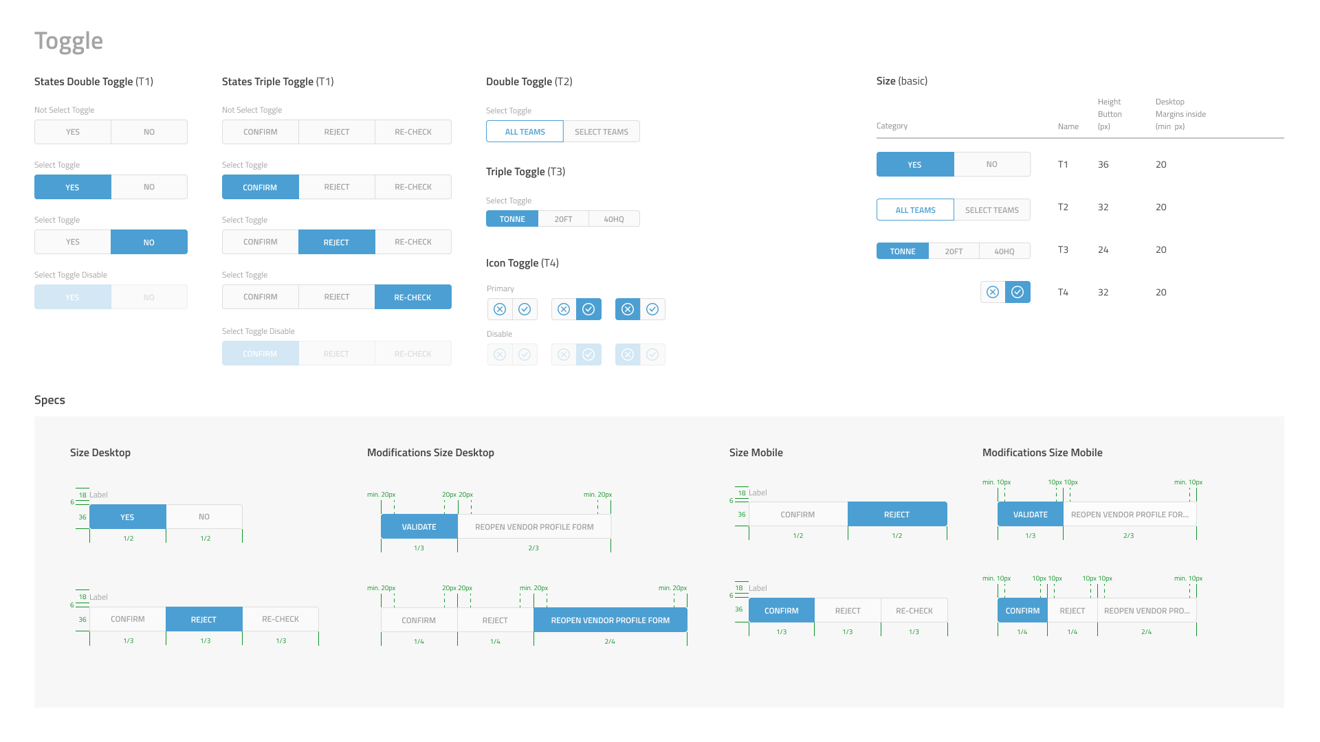
The style guide had clear instructions on how buttons should look and behave. We included examples of different button types, such as primary, secondary, and tertiary to show consistency across all digital platforms. There were also instructions on how to style buttons in hover and active states.
The guide included a set of icons that would be used consistently across all digital platforms. Icons followed a specific design style with sharp edges and consistent form. The guide also provided clear instructions for usage and placement of the icons.
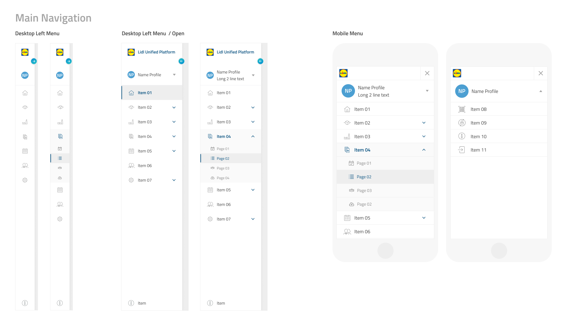
The design of the navigation system was an important aspect of the style guide. The guide included instructions for designing a clear and concise navigation system, including how to account for different screen sizes and device types.
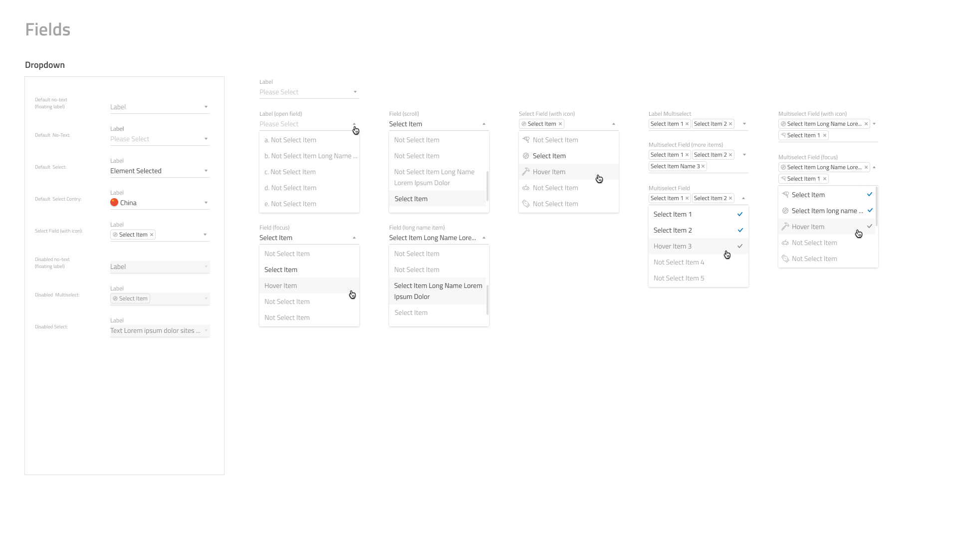
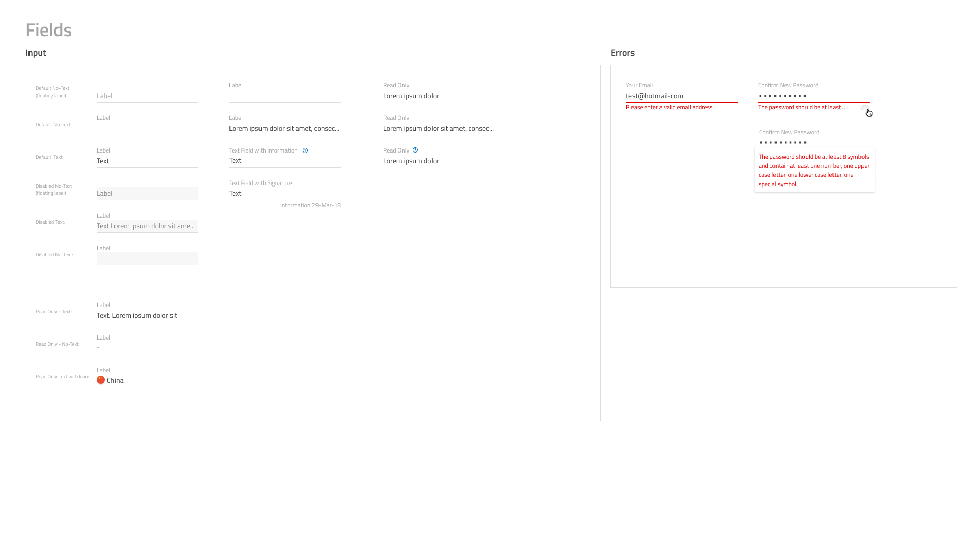
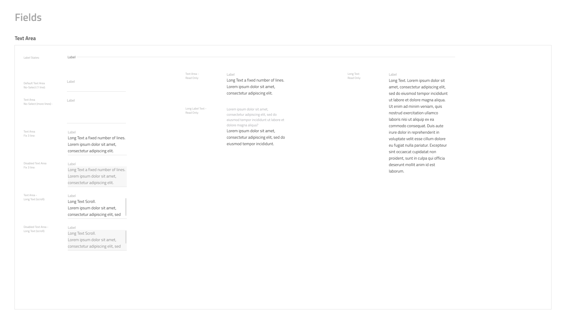
The guide included instructions on how form fields should be designed, styled and used consistently across all digital platforms, including text input fields, dropdowns, checkboxes, and radio buttons.


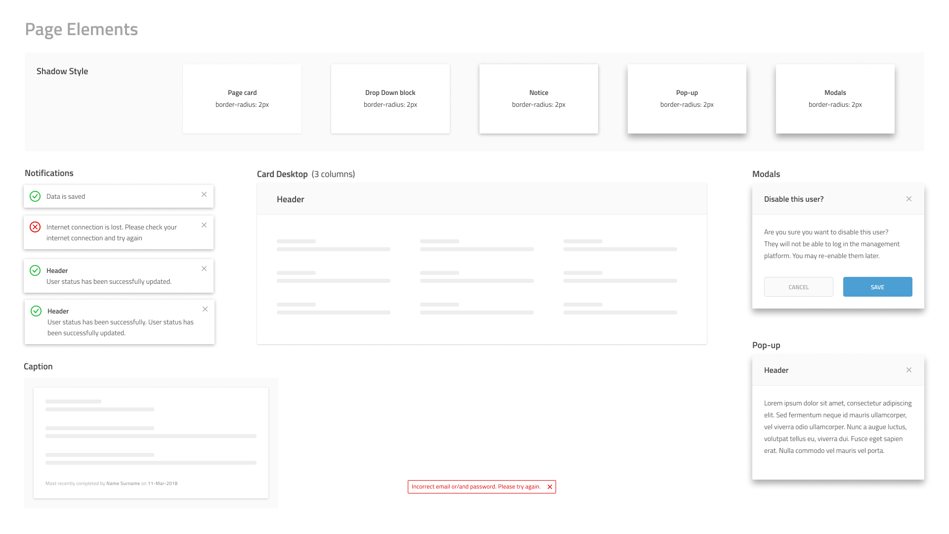
The guide provided clear instructions on how different page elements should be designed, such as headers, footers, and call-to-action elements. It also showed the correct placement of relevant links and details on how to style page elements in different states such as hover and disabled states.


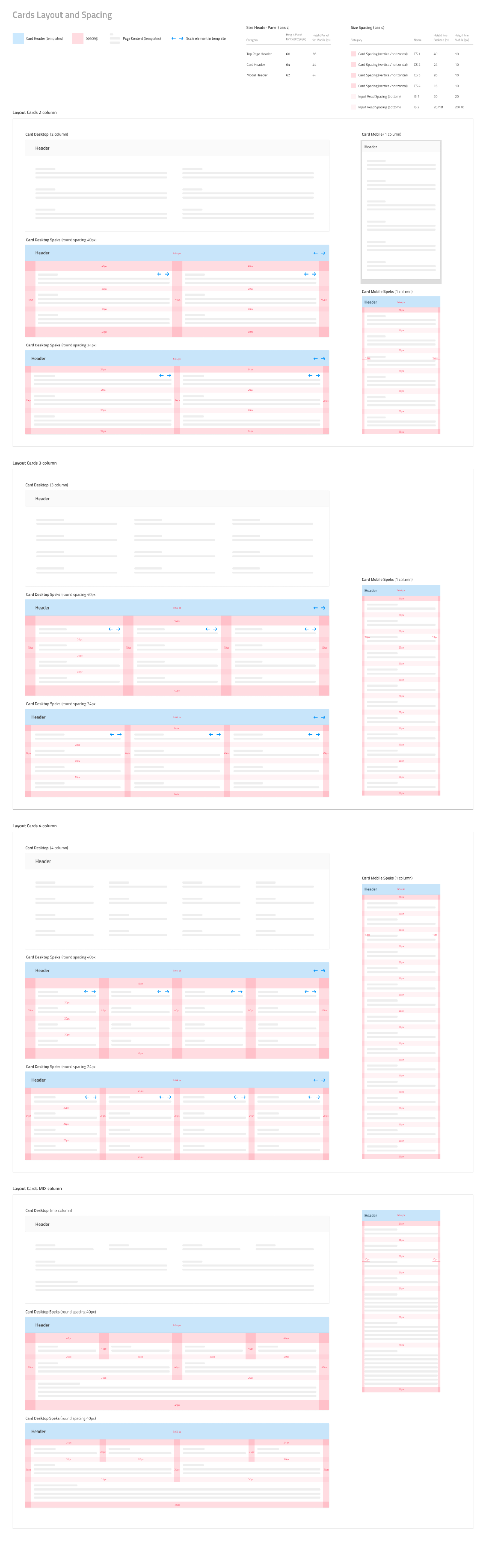
A consistent and well-defined spacing system was designed and documented in the style guide. This included the spacing between different elements, such as margins, padding, and gutter widths. The guide also included clear examples of where to use different spacing options and how to use them effectively.

The style guide provided clear instructions on the construction of individual components of the interface, such as buttons, input fields, and icons. These components were designed with modularity and reusability in mind, making it easier for the developers to create interfaces that maintain consistency.
The Lidl unified platform style guide was designed to unify the digital platform, create consistency, increase usability, and reduce development time. With clear documentation on all design elements, user-interface components, and interface assets, the style guide provided a comprehensive tool for designers and developers to easily maintain consistency across all Lidl digital platforms.
To ensure that the style guide was effective and could be easily replicated across all digital channels, we tested it with various prototypes across different screen sizes and devices. We rigorously tested and optimized the design system while iterating and user-testing with real people.
With the launch of the unified platform, Lidl saw a significant increase in user engagement and satisfaction. The new design system also allowed for faster and more efficient development of digital platforms, reducing development time for new features and products.